renatooliveira
EN PT
Let’s talk
All projects

Visual identity · Web portal

Hub Sebrae RN Identity and Portal

Brand and portal for a platform that connects micro and small businesses to consulting subsidized by Sebrae RN, with a language closer to the people who run them.

Company
Grupo Strategi + Sebrae RN
Scope
Product Visual Identity · Website/Portal
Year
2024

Context and challenge

From a technological, impersonal language to an experience that connects with the entrepreneur.

Context

Sebrae is Brazil’s national agency supporting micro and small businesses. In the state of Rio Grande do Norte (RN), its Hub connects small businesses with subsidized consulting, bringing companies closer to solutions and accredited professionals.

By 2023, the operation had already reached more than 300,000 consulting hours and more than 5,000 businesses served.

300k+

consulting hours in 2023

5k+

businesses served in 2023

The starting point

The previous experience relied on a predominantly gray, neutral identity built on visual references to technology and computer circuits. The language reinforced the idea of a platform structured for selecting services, but did little to speak to or guide the entrepreneur on the other side of the screen, who needed to discover, choose and hire those services.

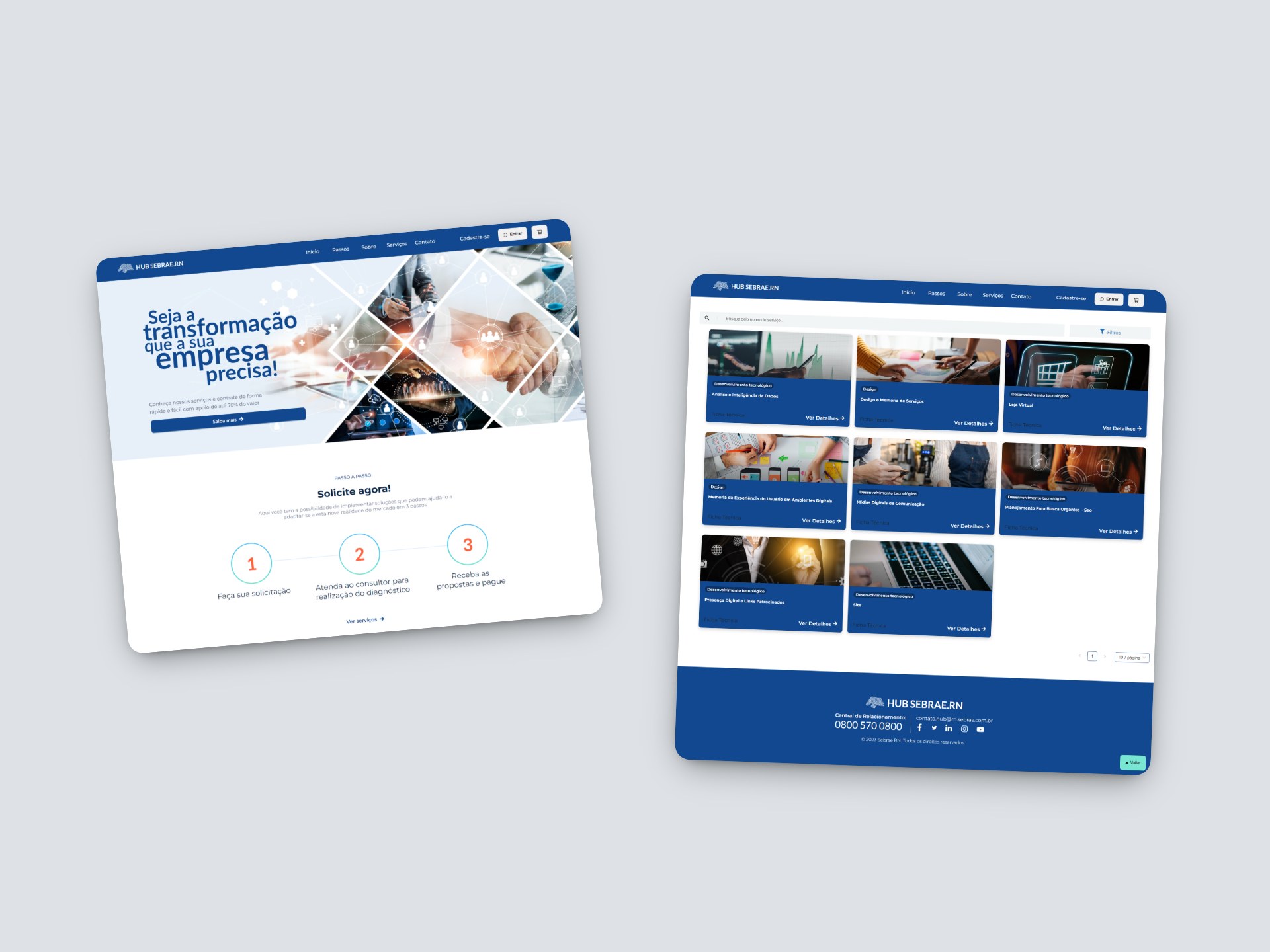
Two screens from the previous version of Hub Sebrae RN: the home page, with a technology-themed image hero and a three-step guide, and the service listing in blue cards.
Previous experience: home and service listing.

What needed to change

What needed to change
Before New direction
Institutional language Closer and more human
Operation-driven experience User-driven journey
Generic, undifferentiated identity Distinct, recognizable identity
Perceived complexity Simpler, guided experience

The design challenge

How do you create an identity that conveys innovation and closeness without losing the trust associated with Sebrae — and turn a complex operation into a simple, inviting digital experience?

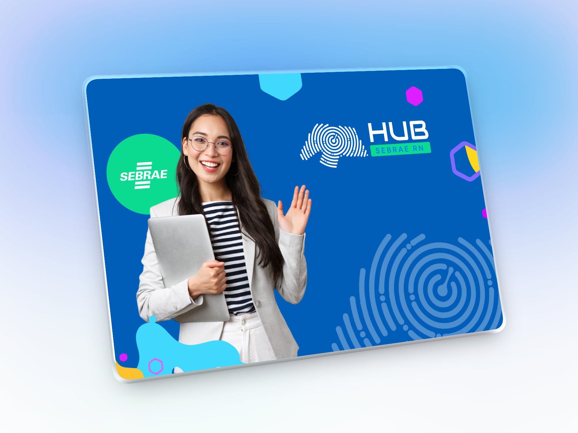
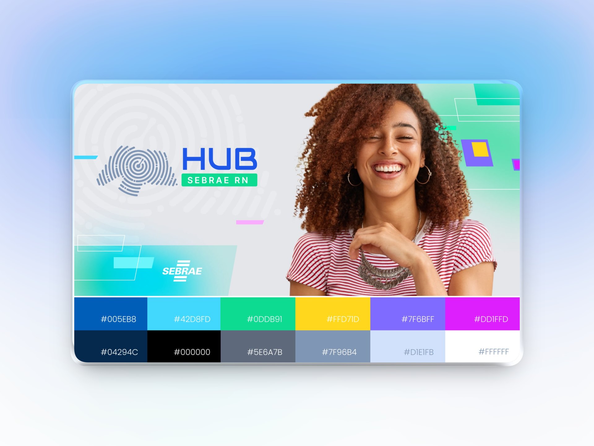
New Hub Sebrae RN identity: fingerprint symbol tracing the outline of RN, HUB logotype with the Sebrae RN seal, photo of a smiling entrepreneur, colorful graphics and the color palette with its codes.
The new identity: symbol, photography, graphics and palette.

From this challenge, the project was carried out on two connected fronts:

  1. 01 Identity Create a distinctive visual language for the Hub.
  2. 02 Experience Translate that language into a clearer, more accessible digital journey built around users’ goals.

My role

From identity to digital experience

I worked on creating the Hub’s visual identity and designing the portal, following the project from the brand concept to the desktop and mobile interfaces.

Scope of work

  • Visual identity
  • Product visual direction
  • UX/UI design
  • Experience architecture and structure
  • Prototyping
  • Desktop and mobile interfaces
  • Alignment with development
  • Validation with business and stakeholders

The solution was built in collaboration with development, Strategi’s leadership and Sebrae RN’s coordination, balancing experience, business and technical feasibility.

Design decisions

01

Brand direction

An identity of its own, connected to Sebrae

The identity was designed for digital from the start. The goal was to create a brand with its own personality, yet still recognizable as part of the Sebrae ecosystem.

The concept

Individuality + territory + closeness

The symbol combines a fingerprint with the outline of Rio Grande do Norte.

The fingerprint stands for the uniqueness of each business, while the territory reinforces the local, close nature of the service.
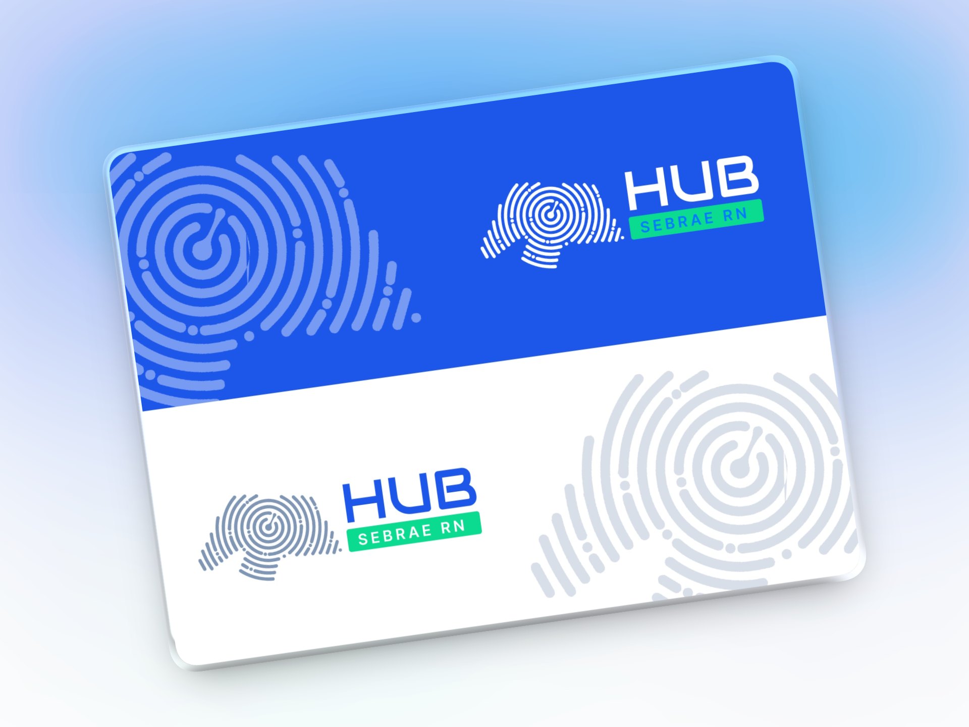
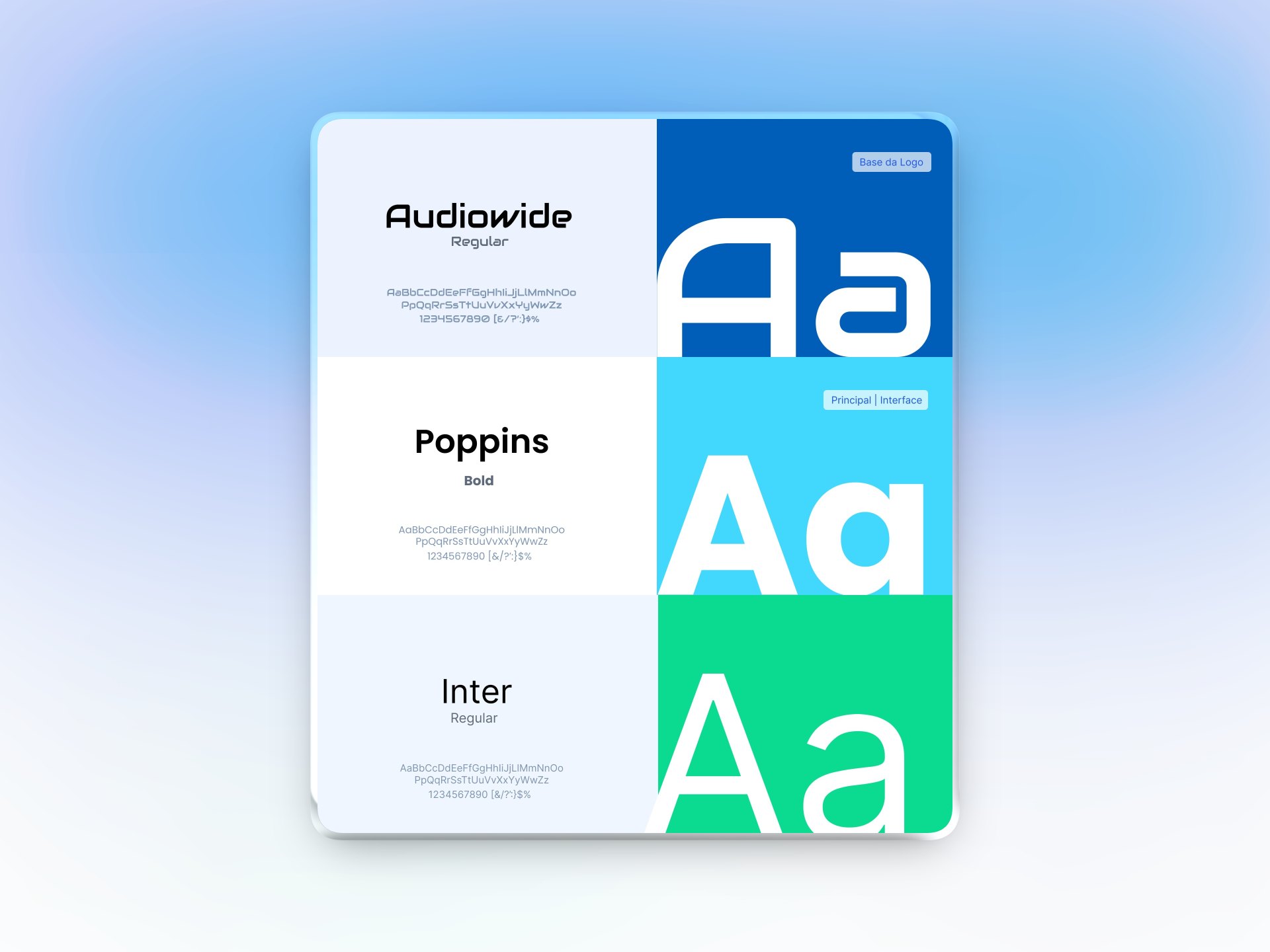
Hub Sebrae RN logo in white on blue and in color on white, with the fingerprint as a graphic element Hub Sebrae RN typography: Audiowide as the logo base, Poppins Bold as primary and Inter Regular for interface
02

Visual system

A more human, dynamic language

The visual system combines the Hub’s own elements with references from the Sebrae brand:

  • Fluid shapes
  • Hexagons
  • Fingerprint texture
  • Parallelograms and slanted lines
  • Photography of entrepreneurs
  • Expanded palette

Sebrae blue keeps the association with trust and institutional recognition, while cyan, green, yellow, lilac and magenta bring more energy and closeness.

Hub Sebrae RN piece in blue with a smiling entrepreneur, Sebrae seal, hexagons, fluid shapes and the fingerprint texture

From identity to experience

An identity designed to work in the product

The new identity was not treated as just a visual layer. Its principles — shapes, colors, graphics and photographic language — were built into the portal experience to create clearer, more human and consistent communication.

  1. Identity
  2. Interface
  3. Experience
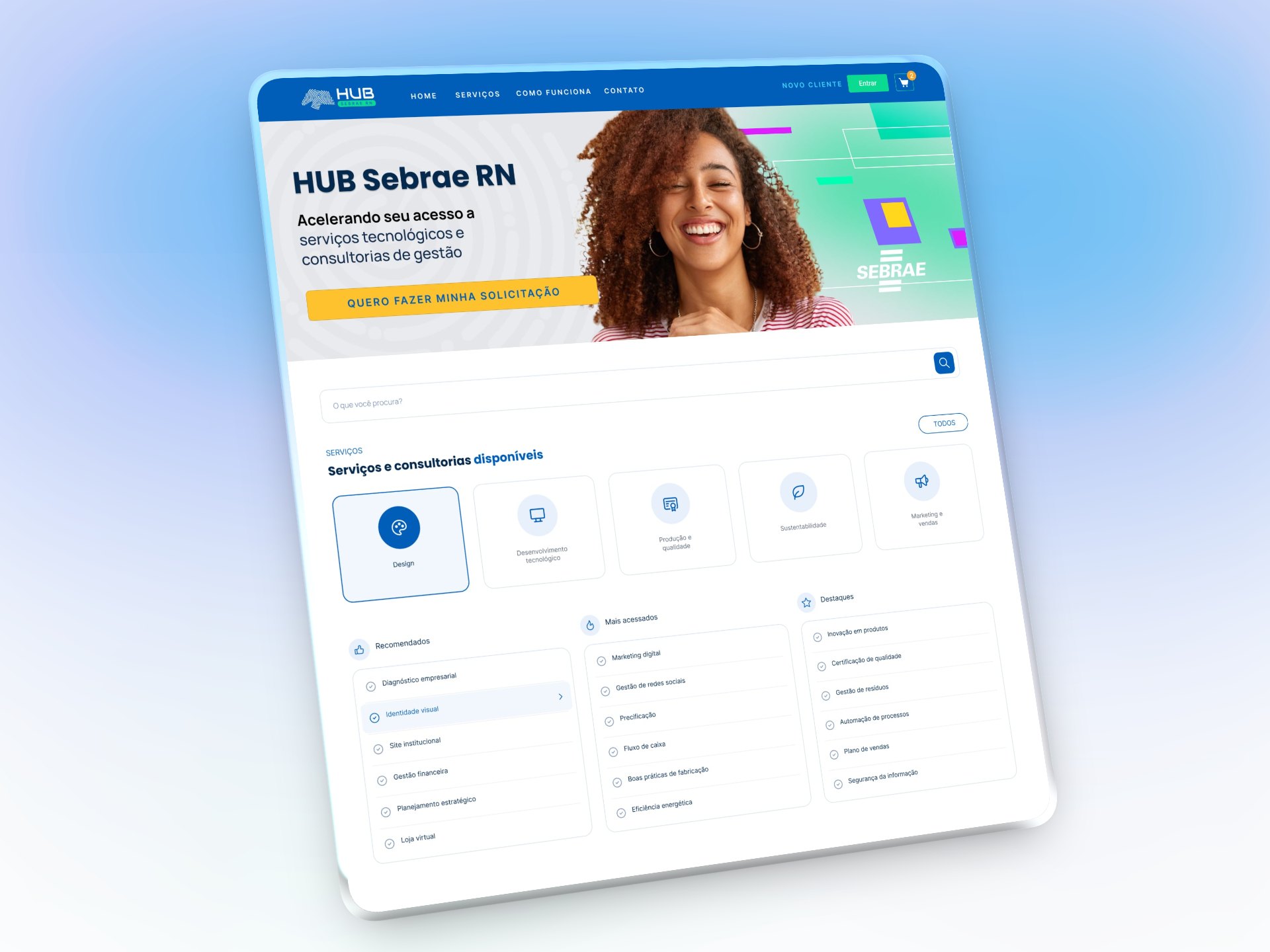
Hub Sebrae RN portal home on a tablet: hero with an entrepreneur, search and service categories.

Experience architecture

One platform. Different needs.

The Hub connects different players within the same ecosystem. For the public portal, the experience was structured mainly around two goals:

Entrepreneur

Find a solution for the business

Search → learn → request → hire

Provider

Offer their services

Discover opportunities → list services → serve

The experience architecture was organized so that each audience could quickly find its way, without turning the platform into an overly complex interface.

Entrepreneur

  1. Services
  2. Request
  3. Diagnosis
  4. Hiring

Provider

  1. Accreditation
  2. Services
  3. Service delivery
The two main paths through the public portal.

Key UX decisions

From discovery to starting a request

The portal is the Hub’s front door. Its role is to help entrepreneurs find a solution, understand the offer and start the request process.

01

Find

The experience starts with discovering services.

Search, categories and featured items offer different paths to a solution, even for users who don’t yet know exactly which service they’re looking for.

[Screen · Home, search and categories]
02

Learn

Once they find a solution, users need to understand whether it fits their business.

The service page organizes information such as description, target audience, field and offer details, reducing uncertainty before the next step.

[Screen · Service listing]
[Screen · Service details]
03

Start the request

From the chosen service, the portal shows the way to start a request.

Users are directed to sign in to the platform, where the journey continues.

[Screen · CTA and request start]

Portal

Find Learn Start request
Login
Hub Platform The journey continues
The portal leads up to starting the request; the journey continues on the platform.

UI & digital experience

Identity applied to the experience

The new identity was translated into the portal interface, creating a visual language of its own without losing the association with the Sebrae ecosystem.

Identity

ColorsShapesGraphicsPhotographyTypography

Product

HierarchyNavigationComponentsCTAsContent

Home

The home page brings together the main discovery paths and presents the Hub in a more visual, entrepreneur-oriented way.

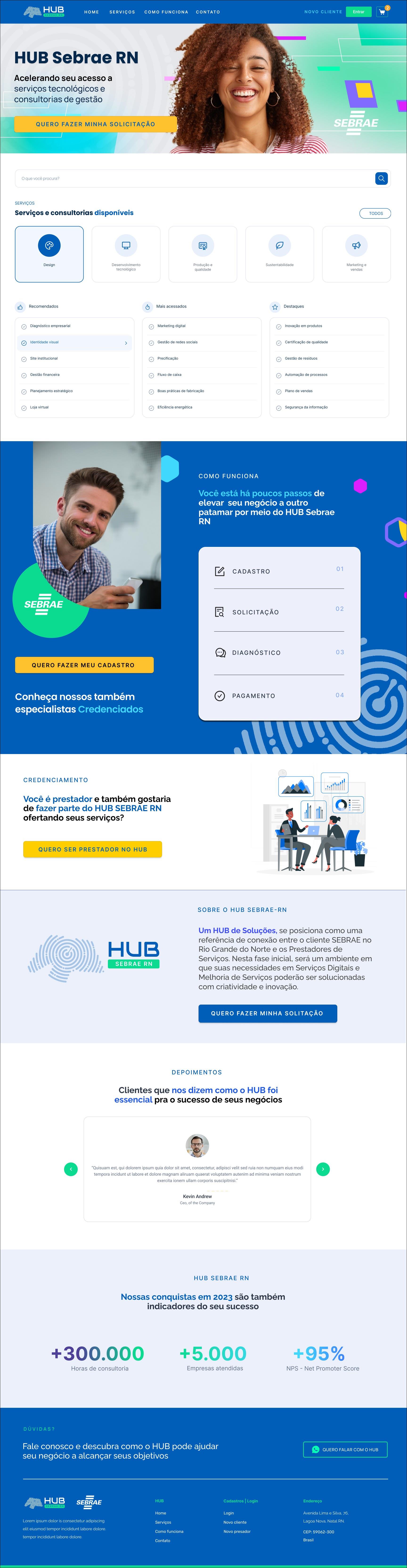
Full Hub Sebrae RN portal home page: hero, search, service categories, recommended lists, How it works section, provider accreditation, about the Hub, testimonials, 2023 figures and footer
Desktop home. Scroll inside the window to see the full page.
[Screen · Mobile home]

Search and categories

The way services are organized offers different paths to finding solutions.

[Screen · Search]
[Screen · Categories and service listing]

Service details

The page gathers the information needed to understand the offer and decide to start a request.

[Screen · Desktop service details]
[Screen · Mobile service details]

Starting the request

The CTA marks the transition between the public portal and the authenticated platform.

[Screen · CTA and transition to login]

Responsive experience

The same visual language was adapted to different access contexts, preserving hierarchy, content and main paths.

[Composition · Desktop + mobile]

Results

An identity that evolved with the product

The project established a new identity for Hub Sebrae RN and translated it into a digital experience that is closer, clearer and built around the entrepreneur.

Key result

Identity approved
for the SaaS evolution

The new identity was approved to be incorporated into the Hub’s SaaS, becoming a visual reference for the product’s evolution.

  1. Portal
  2. Identity
  3. SaaS
  4. Hub ecosystem evolution

Secondary results

  • 01 New identity A proprietary visual system, connected to the Sebrae brand and closer to the entrepreneur.
  • 02 New experience A portal structured to make it easier to discover, understand and start requesting services.
  • 03 Visual scalability A system able to adapt to different contexts and product interfaces.
  • 04 Product evolution The identity went beyond the portal and began shaping the visual evolution of the SaaS platform.