
Digital channels
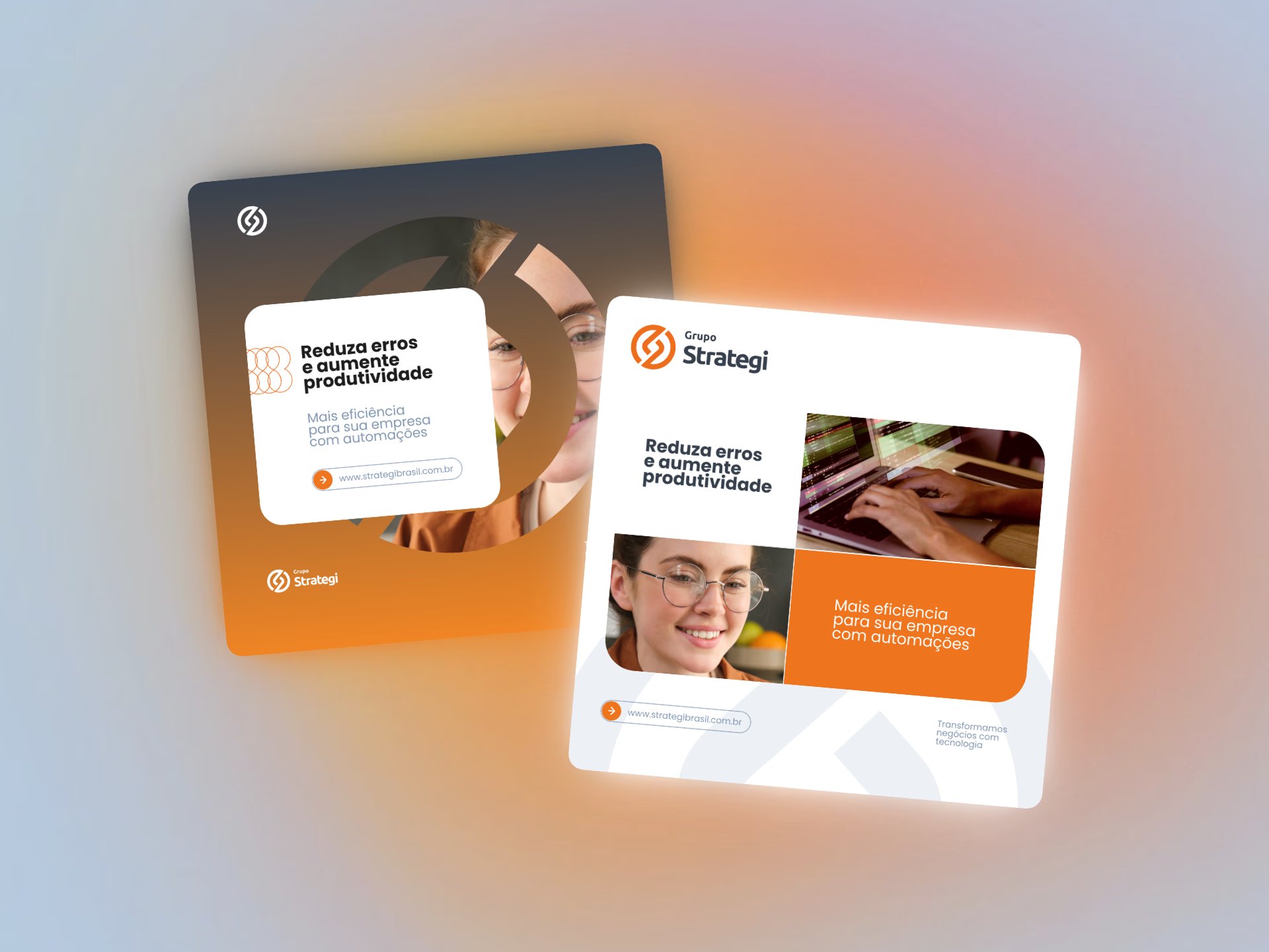
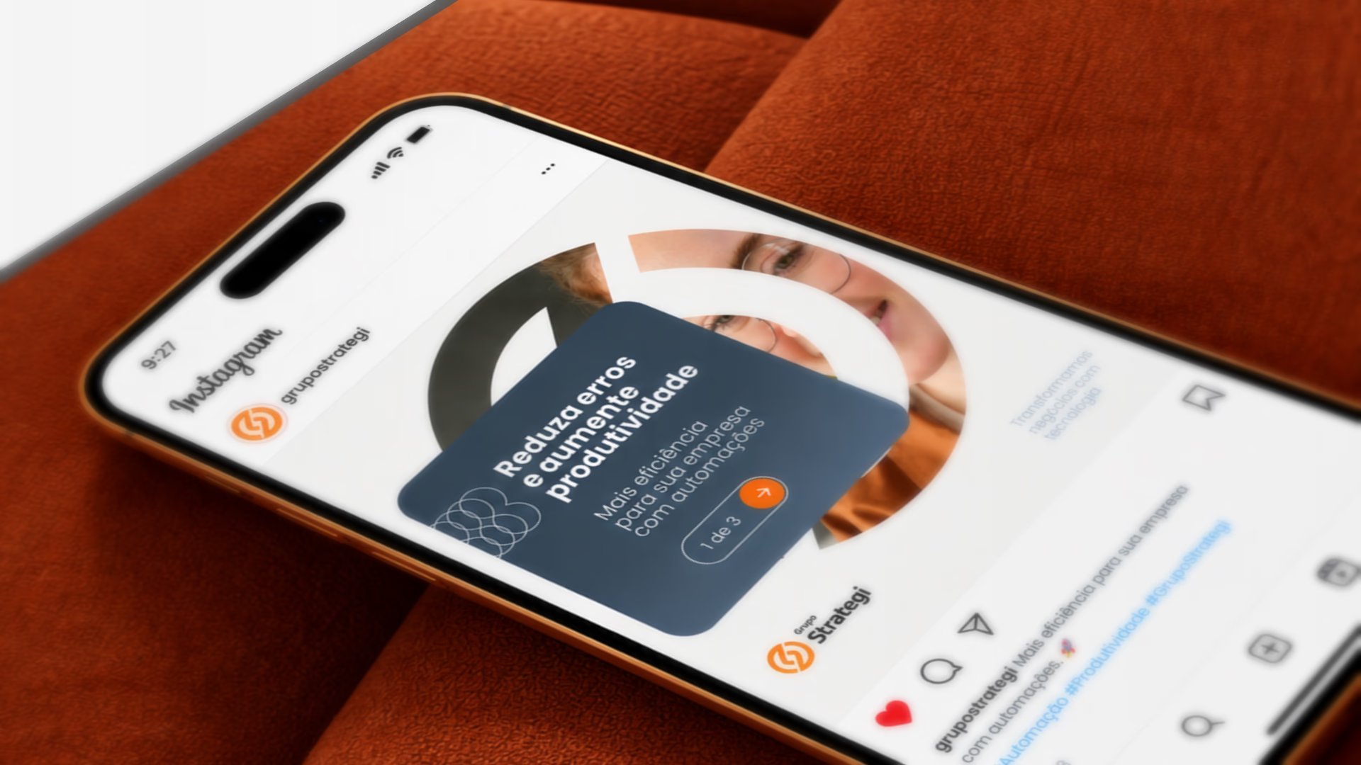
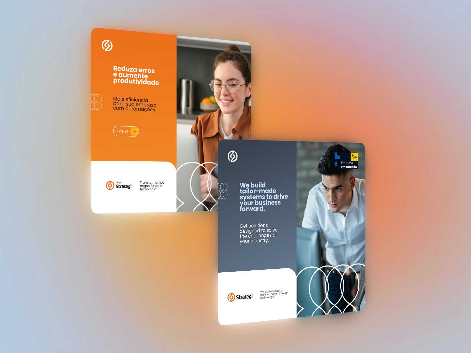
On social media, the language was adapted to different messages and formats, keeping unity across posts and letting the communication unfold as needed.
Branding · Visual system
A single, versatile visual language for the group’s five business lines, applied from social media to events, with a premium feel and faster production.
Grupo Strategi operates across five distinct business lines. Each has its own audience, type of message and communication pace, yet all of them needed to be recognized as part of the same brand, whether on social media, in presentations to clients and partners, or at events.
However, each piece was created in isolation, without well-defined standards. The result was inconsistent communication that was hard to recognize and slow to produce.
Solving this required a visual language versatile enough to support a constant flow of content and serve every business line consistently. At the same time, it had to avoid monotony: a feed with many posts on different topics needed to keep brand unity while staying visually interesting.
On top of that, the communication had to convey a premium feel, matching the group’s positioning as a provider of high-value technology solutions for strategic business decisions.
I was directly responsible for defining the elements of the visual system, creating the application standards and producing every piece.
I worked closely with leadership, based on needs assessments, expectation alignment and visual tests to validate the language and ensure it was applied correctly.
Instead of designing isolated pieces, the work started by defining a system: a set of elements and rules that could be reapplied at any touchpoint.
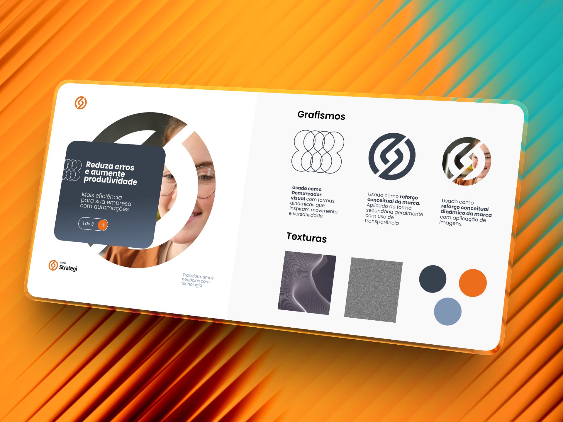
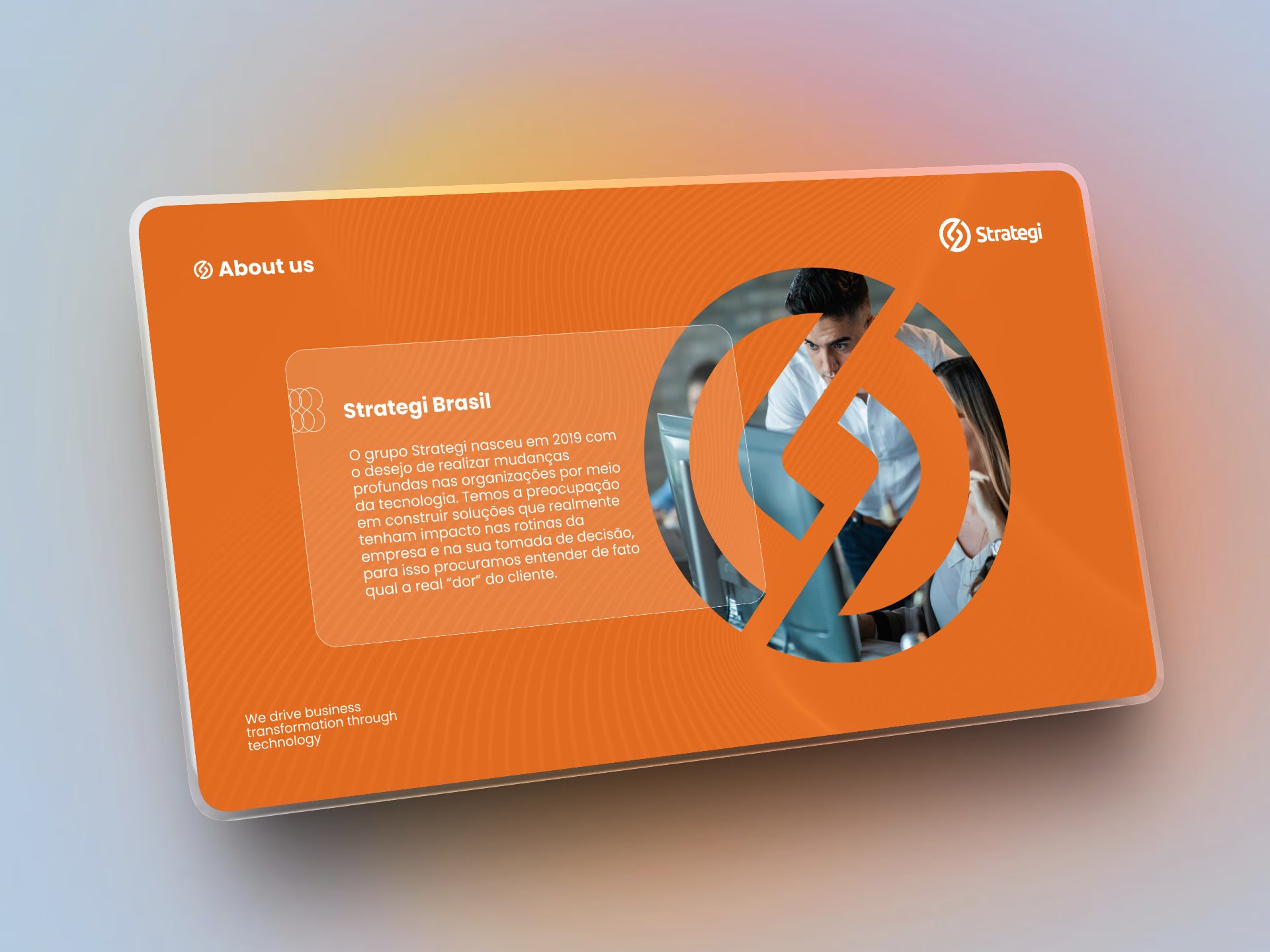
The system relies on three graphic elements with distinct roles. The interlaced-circles pattern acts as a visual marker, with dynamic shapes that convey movement and versatility. The brand symbol appears as a conceptual reinforcement, applied in a secondary role with transparency. The symbol also works as an image mask, creating a more dynamic conceptual reinforcement and bringing people into the identity. With clearly defined roles, the elements can be combined in different ways without losing coherence, which helps avoid repetition in the feed.
The palette is restrained: a graphite blue as the base, the brand orange as the accent and a greyish blue for support. Orange is used sparingly, at points of attention such as the symbol and calls to action. Wave-line textures, evoking technology and data flow, and grain, which adds depth to surfaces, complete the language. Together, these choices support the premium feel of the communication.
A geometric sans-serif in different weights structures reading: bold headlines for the main message, regular weight for supporting copy and smaller sizes for complementary information. The clear hierarchy keeps small formats like posts legible and maintains a modern, objective tone that fits a technology company.
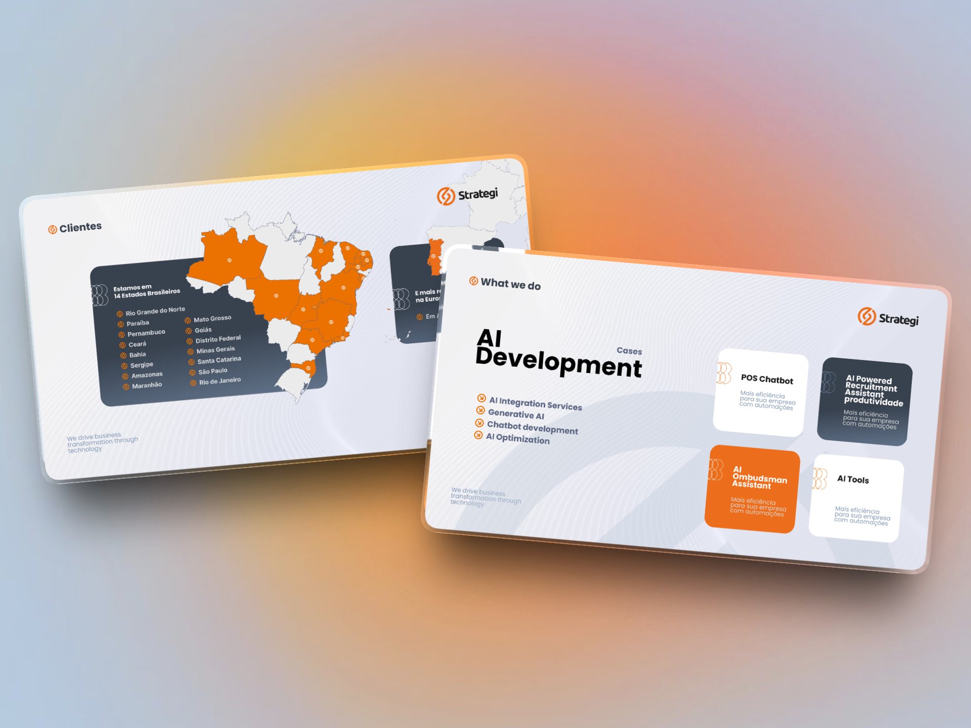
Pieces combine a rounded card that holds the text with images masked by the brand symbol. The signature, with logo and tagline in fixed positions, creates a recognizable frame while the center of each piece changes with the message. In carousels, a navigation indicator in the accent color guides reading.
The layouts were organized into a template library in Figma, shared with the social media team. The team could then produce pieces autonomously, applying the visual language consistently without designing each piece from scratch.
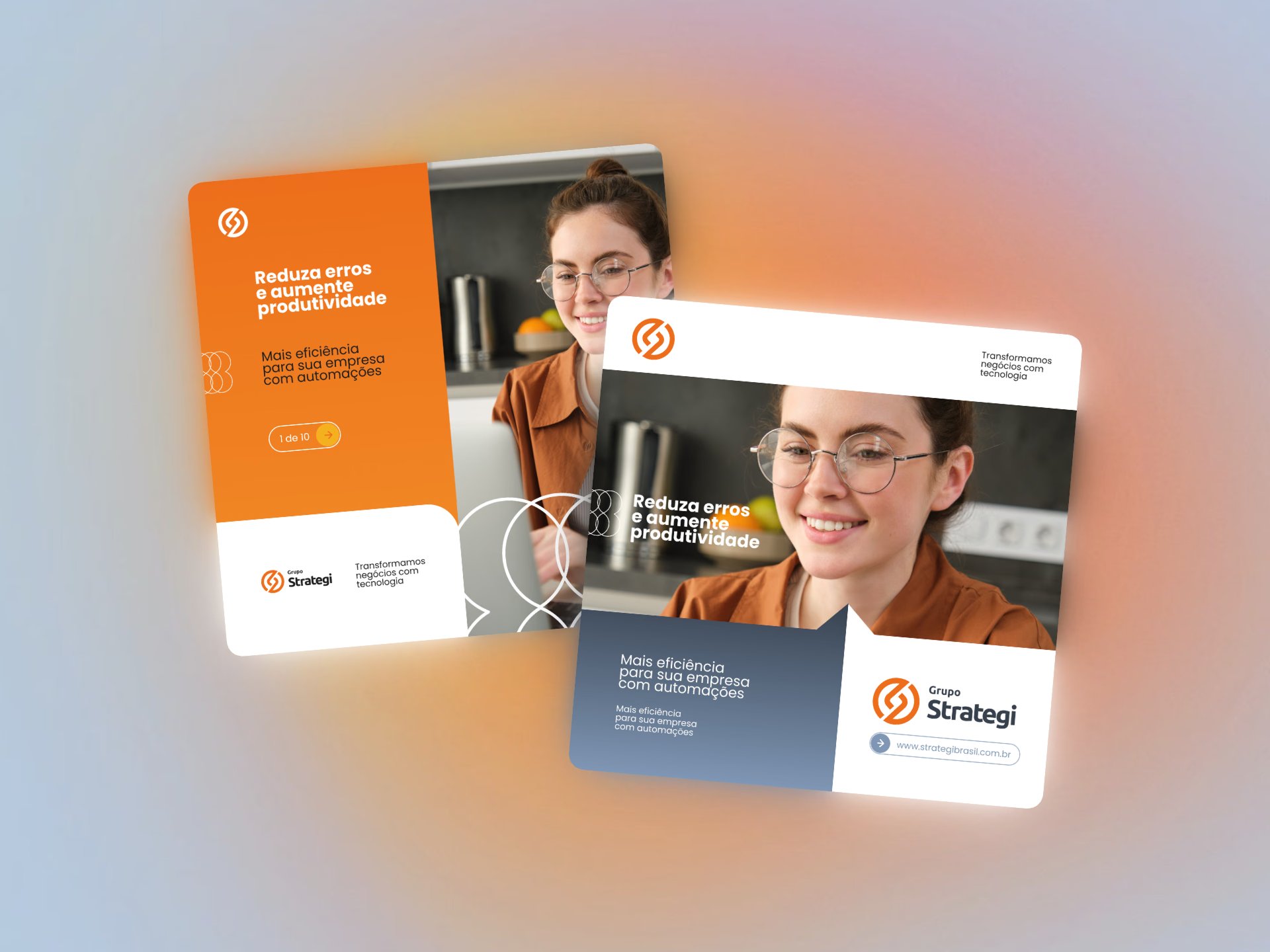
On social media, the language was adapted to different messages and formats, keeping unity across posts and letting the communication unfold as needed.
The same language shaped presentations and materials used to introduce the brand, its services and its work.
Standing displays, booths, banners and signage extended the system to events and physical spaces, connecting digital communication with in-person contact with the brand.
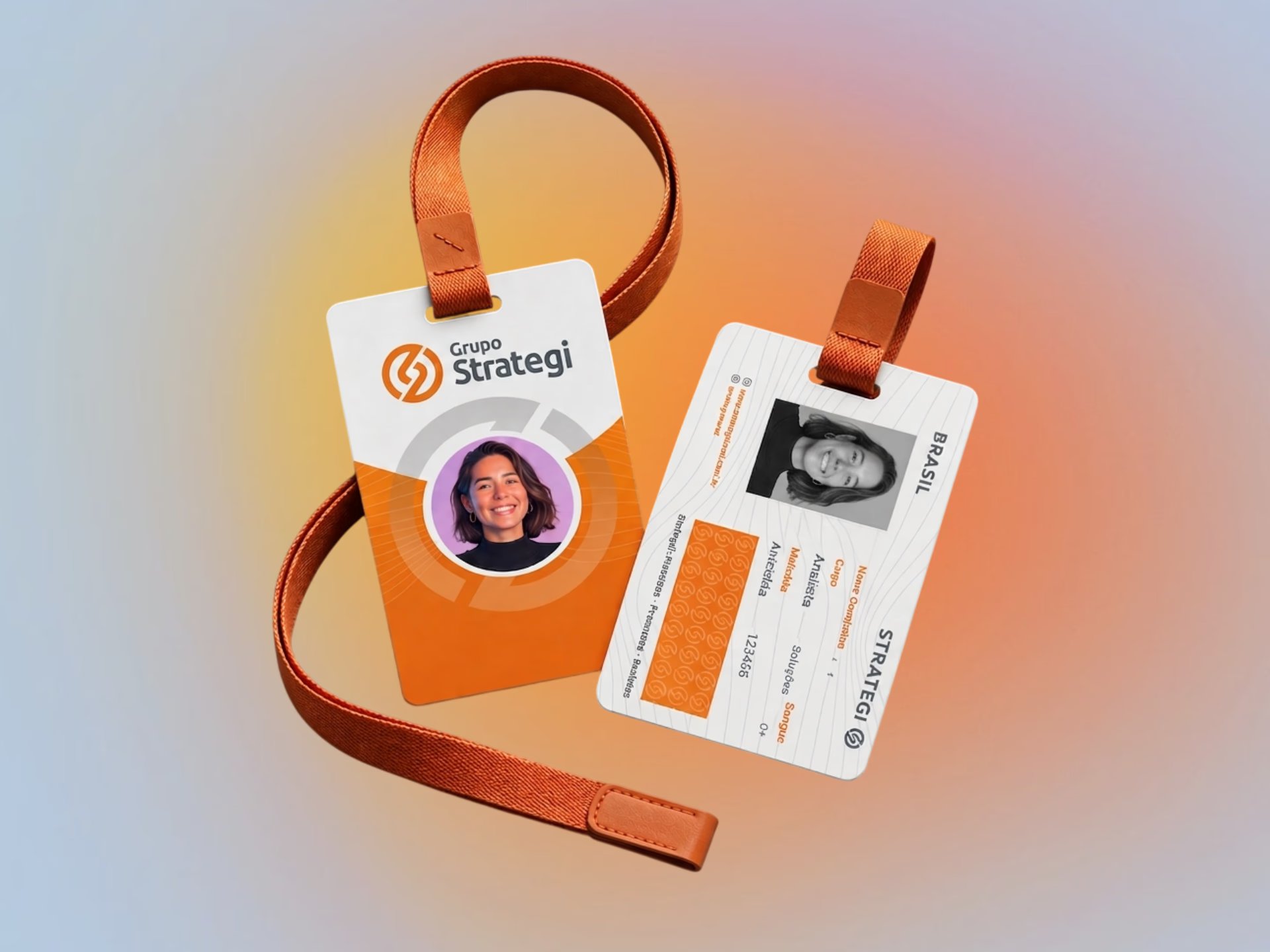
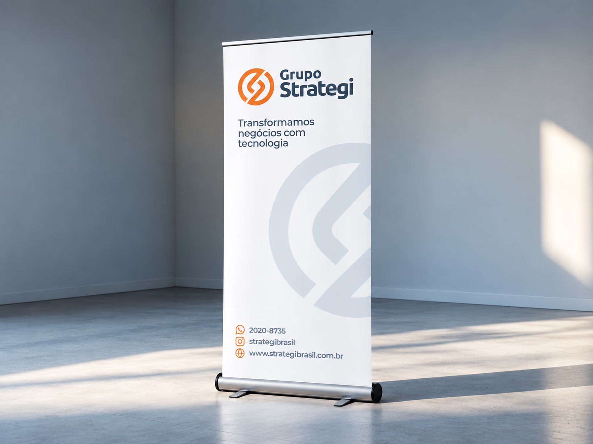
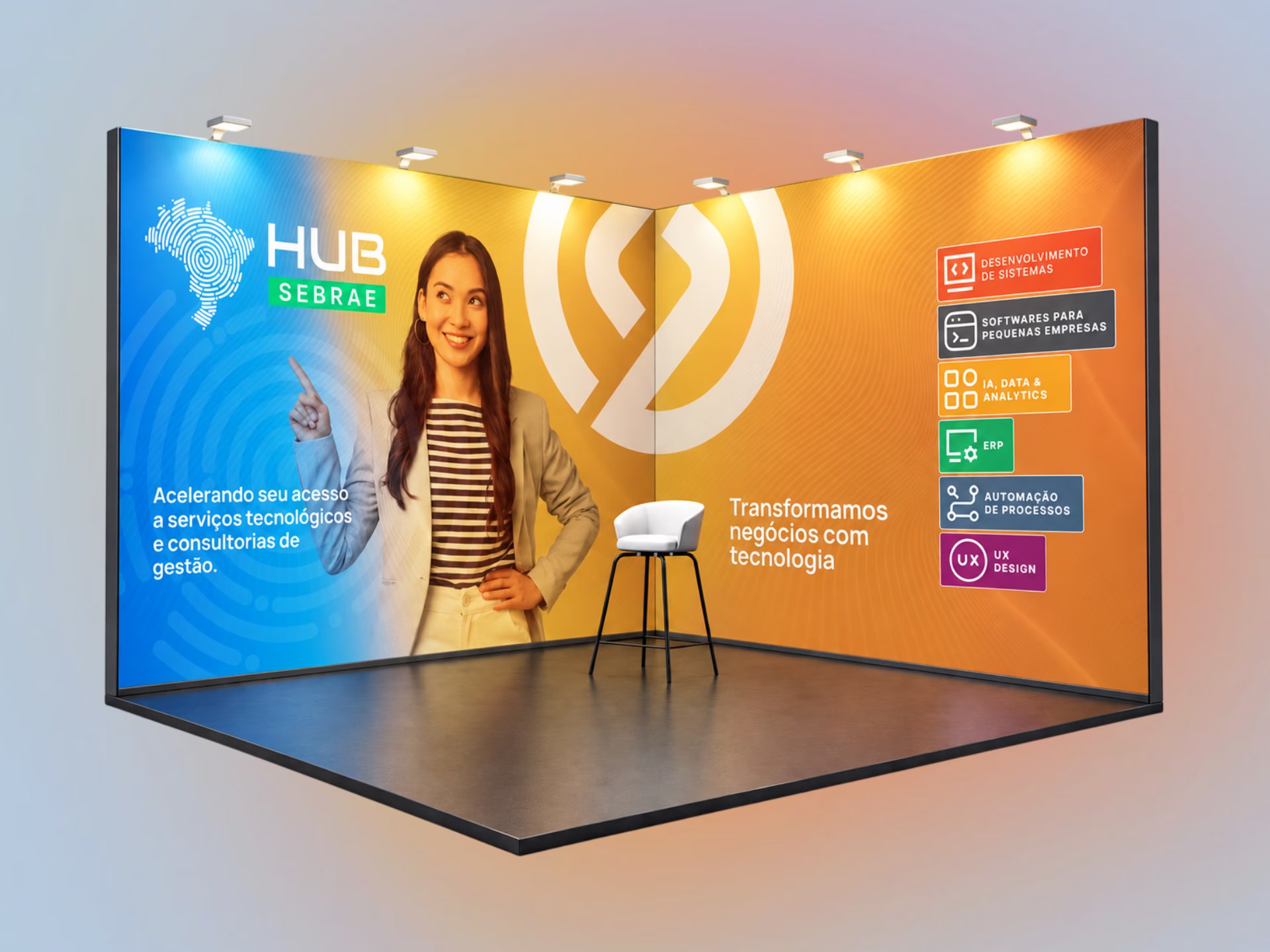
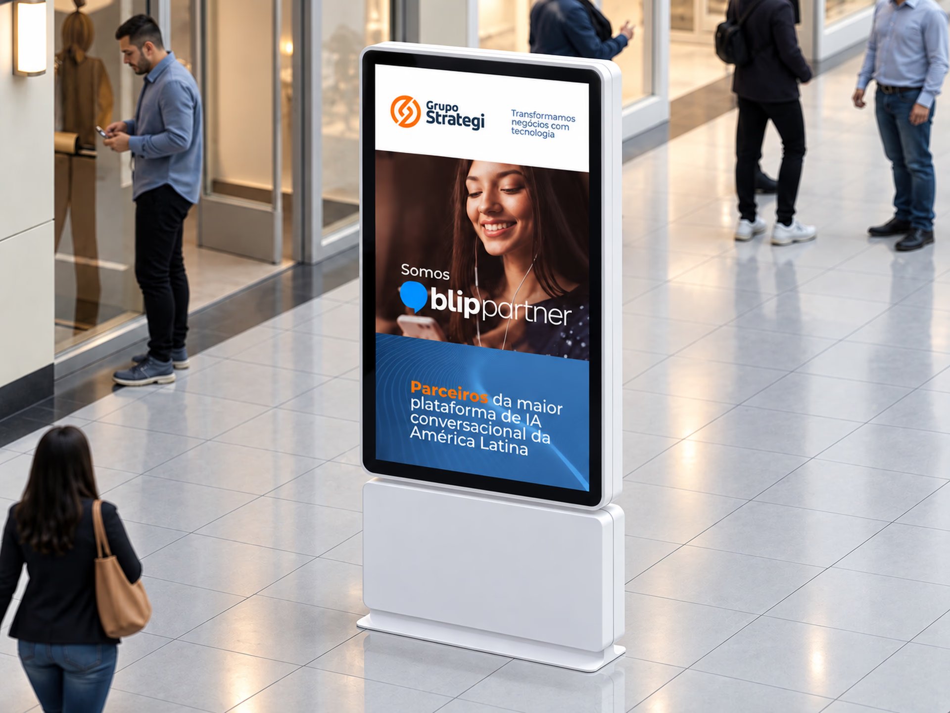
The visual system now supports communication for all five Grupo Strategi business lines with a single language, recognizable at every touchpoint: social media, presentations to clients and partners, events and physical spaces.
With the Figma template library, the social media team gained the autonomy to produce content without designing each piece from scratch. Production moved from case-by-case to defined standards, becoming faster and more consistent.
The range of layouts made it possible to keep a steady volume of posts on different topics without a repetitive feed, while the restrained palette, textures and graphic elements reinforced the brand’s premium feel.